Construction
UX Design & optimization of a B2B Mobile application
Sr. UX Designer on a B2B mobile app
-
User flows
Wireframing and prototyping
In-depth Interviews
Usability testing
Ideation, Co Creation & Product vision Workshops
-
Figma
Miro
Atlassian Suite
Tablaeu
-
UX lead on one cross functional team
During my time on this project I was tasked with the following points:
Design and implement an order management feature in a mobile app with the goal that would replace 70% of calls and emails to the company’s call center.
Redesign parts of the app to optimise the overall user journey from order creation to delivery tracking and account management.
Increase user engagement based on feedback from subject matter experts and end users.(This proved to be slightly challenging since it was more difficult to recruit end users than it was to recruit subject matter experts)
Business Requirements:
Reduce workload on call center agents by reducing the number of orders via calls they would receive daily
Increase digitalization of services by providing more features in the app that provided more flexibility in order management.
Encourage existing and new customer bases to move from traditional working modals (paper documents and phone calls) to digital modals provided by the company.
After a short ‘understanding the user and the business’ research round, where I spent a month studying the persona’s wants, needs and pain-points as well as the main business requirements and end to end (sales to delivery) journeys created by the service design team. I was able to align on two main problem statements with the PO, Researcher and Technical Lead. (We had cross functional teams with the researchers and service designers floating between all of them) From the defined and agreed upon problem statements, how might we questions were developed and then turned into user stories for the upcoming sprints.
First Draft Screens and prototype to test
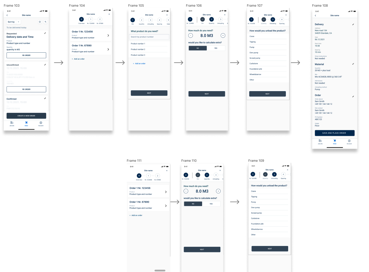
In addition to refining the end to end journey within order management, improvements were made to the app layout and overall interface experience through minimal tweaking and minor additions. Some of them are displayed in the image below.
We knew the users wanted to refer to their order history to simply re order that exact same quantity and type, so we introduced an access point on the main ordering page.
A user can average on 20 different material orders, with 20 different quantities and delivery dates, in order to be able to sort through the chaos, and find their specific order with ease, the team decided on implementing both an orderlist ‘sort’ feature and an order ‘search’ feature. The user can now sort their orders for the next two weeks based on their needs and preferences, as well as search for any previous or upcoming order with a specific name or timeframe.
The access point to the ‘order management’ user flow (specifically editing an existing order) was placed on the order card itself. This provided an easy visual access point for the user and complies to universal best practices.
The visual order of the orderlist was confusing to not only the users but the team as well. We quickly realised one of the low hanging improvements we could do was to label the sorting of the displayed orderlist. Meaning if the user sorts based on same day delivery time, the label should reflect that.
One of the most rewarding things that can happen as designer is having a client that matches your enthusiasm and passion for human centered design and entrusts you with multiple projects. This particular client is a major material construction company focusing primarily on raw material production & distribution. They are considered to be one of the biggest material providers worldwide. I had previously done a research project with them spanning across four internal (personas being the employees) product suites.
This time around I was asked to join as a designer (not a researcher) on the customer facing side.
Project Parameters and Deliverable
Persona & Design framework
Understanding the persona and their needs, as well as refining the framework for design sprints
The persona in focus here is on the customer facing side. The end users who are both using the product and are calling the sales agents daily.
The typical customer I was designing for was a ‘Jobsite manager’ at a construction site whose responsibility is to order responsible for ordering the appropriate materials needed to complete their tasks and the appropriate quantities to the site.
Due to the nature of the field, it was difficult getting direct access to real life ‘Personas’, The sales agents had the most direct contact to Jobsite managers. In order to understand the persona more, I spent a day shadowing the sales agents at one of the main call centers in Berlin. and was able to conduct a few ‘informal’ interviews with them. Through conversations with the sales agents we were able to understand exactly how ‘a day in their life’ panned out and who were the users who called and how often. At the end of the day they receive over 200 calls a day to their respective call center. They are the main customer facing company representatives available and they create a familiar bond with their jobsite manager. Which led to a few questions that baffled us as a team for a while.
How could we replace this relationship in an app?
Should we replace this relationship?
Can we supplement the experience in the app to the experience with the agent, to create an overall holistic customer experience?
Concept and Userflows
Other Improvements
Miscellaneous Experience improvements in the App
Before we moved onto the designs, I facilitated a global co creation workshop with LEMs ‘Local Engagement Mangers’ whose role is to facilitate headquarter endeavors in their respective countries. They are the main subject matter experts that the product teams referred to on a regular basis.
In the workshop, my team and I, were able to get instant feedback on our order management concepts and together with the participants we were able to prioritise features and were able to narrow down what should be present in an initial MVP.
Design Iterations
User Flow & integration into customer journey
After the workshop, the team and I went back to the drawing board and were able to refine the journey, and the main ‘interface’ requirements for the success of this feature. Most of the ‘issues’ we faced had little to do with the actual design, rather it had more to do with how the overall experience was curated. Most of it had to do with refining customer points or automation of processes hidden to the user.
We knew from the workshops and from the research, that our end users, have been in the industry for a long time, so they know, for example, what their material mixes are officially called.
So instead of us focusing our efforts of micro copy and renaming the mixes, we focused on a solution that could eliminate any confusion as to what this mix actually has. In the backend we focused on extracting the types of material this specific user orders based on order history and existing contracts ( a user cannot order a material outside their contract) So ultimately, the user would not have to manually put in the mix name in an open text field anymore, instead the user would select the mix from a predetermined drop down.
Check out my next project!
UX Research in Construction


