


Fintech
Offer page optimisation & redesign
UX Lead on two Cross Functional Teams
An online loan comparison platform specializing in low interest rate loans, was in dire need of an UX optimisation plan. Together with the respective team Product Owner and Technical Lead we were able to define main goals and targets for this project, and for the product as a whole.
On a whole, this collaborative effort towards the end of my term resulted in a revenue increase of €2 million per month and improved sales conversion rate by 30% .
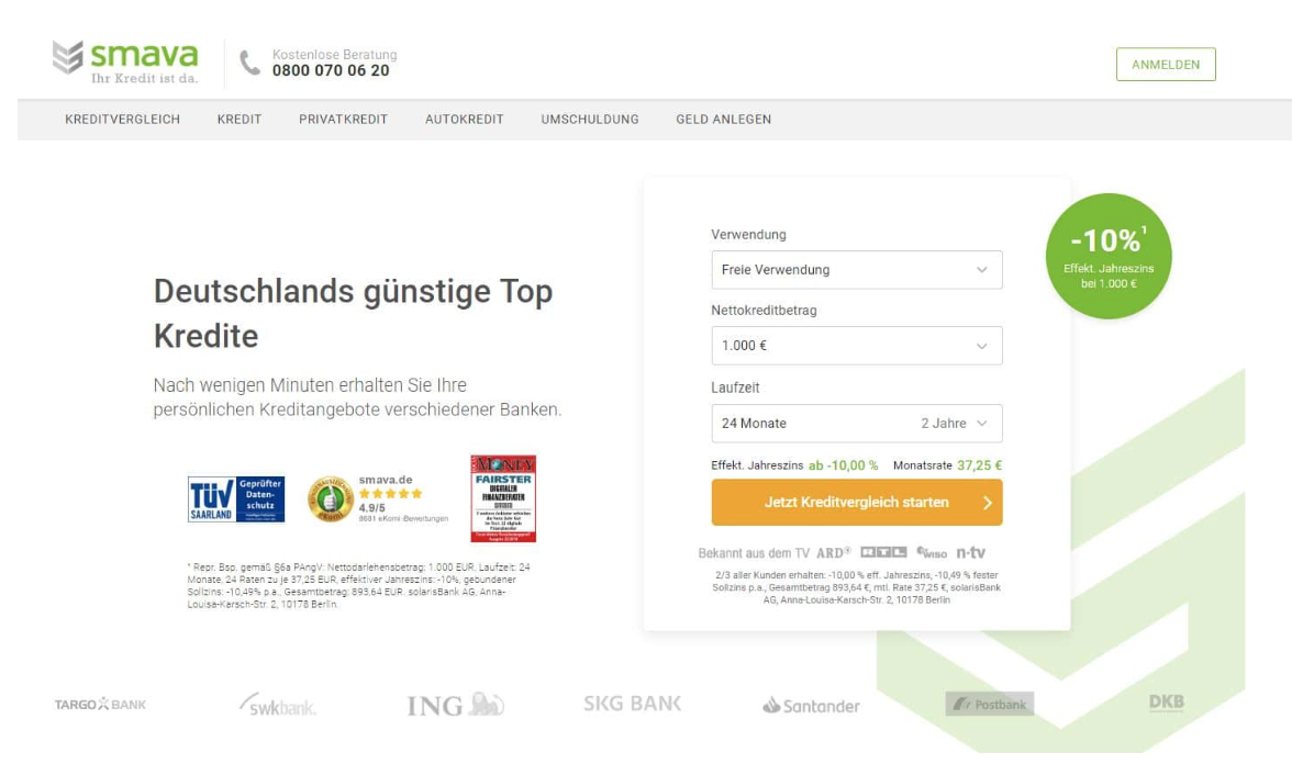
Original entry point and header
-
Competitor Analysis
Persona definition
User flows
wireframing and prototyping
In-depth Interviews
Usability testing
Design sprints
Ideation Workshops
Heuristic evaluation
UX Audit
-
Sketch
Abstract
Zeplin
Github
Atlassian Suite
Airtable
Hotjar
-
UX Lead on a cross functional team of 2 designers (UX and UI) 4 FE developers, 2 BE, 2 QA, 2 researchers, 1 PO, 1 TL and 1 sprint master
Project Parameters and Deliverables
Project Overview Led multiple initiatives at smava focusing on internal process optimization, design system development, and conversion rate improvement for their digital lending platform.
Key Initiatives
Process Optimization
Workshop facilitation and service walkthroughs
Iterative development sprints
Design System Development Created unified design language across all products.
Conversion Optimization Redesigned the Order Page to improve loan offer selection and checkout process, balancing e-commerce practices with financial product complexity.
Problem definition & Analysis
Initial discovery research and insights
From the business perspective their main issue was a low conversion rate. A deeper look into the product funnels and flows, as documented on google analytics and tableau, revealed multiple design flaws that were later documented and presented in the form of a UX Audit. The main results of the audit and online behavioural data throughout the funnel were written up and communicated to the respective teams and design leads.
I defined the usability issues with the ‘Offer Page’ with a Usability Audit and communicated the results to my team :
There is no possibility for the user to change their search criteria
There is no way for the user to narrow down their search criteria
It is hard to differentiate between all the offers, for example, all loan amounts were displayed in a ‘first come first show’ logic, which created an unorganised display of offerings.
There is a cognitive overload of information on the page and it feels randomised.
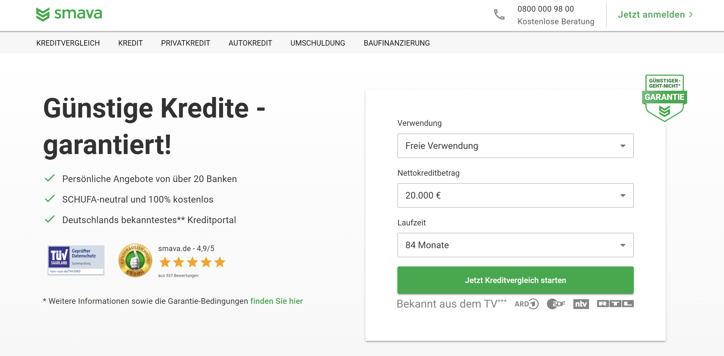
Optimised entry point and header after rebrand
Together with the user researchers on the team (qualitative and quantitative), we were able to design and establish a design-research process in between the existing product development sprints to ensure that research played a strong role in feature definition. Moreover, research (In depth interviews, ne survey starts or usability tests) were performed in two week sprints starting with discovery research with in depth interviews to generate insights, along with a survey launch to ensure the numerical validation of the insights and finally usability testing, scheduled biweekly, of wireframes concepts and of course final beautiful designs.
With each feature implementation, event tracking was programmed and real time data was captured to furthermore help to curate the design experience of our users, with our users. The design concepts created were based on one or all of the persona archetypes (mainly focused on Rationalist, since they appeared to be the main type of users to come to the platform)

Pre defined persona ‘archetypes’ from the User Researchers
Concept Design
Wireframes and Design Iterations
Once the insights were defined and communicated to the team, we were able to then start defining use cases, user stories, jobs to be done and ultimately design new flows & interactions.
One of the main insights that was transformed into a use case was:
‘The user is unable to determine which loan offering matches their search criteria, and is confused as to why there are other offerings that do not match their original search criteria.
To them, they do not understand if they are eligible for these other offerings or if there was a problem in the system. The team approach therefore here, was a holistic one. After the communication of these insights to the team, we were divided into ‘Overall customer experience’ ‘Technical CX support’ and ‘ UX & Interface Design’
The designers, developers and PO worked closely together to determine the overlapping points of communication between all team members, dependencies on other team members or departments, a product roadmap and team plan was devised by the team and for the team. It was a success. It started small, with 3 months planned, then grew into 4 quarters. The image below shows the skeleton of our end goal. We knew as a team, that this is what we wanted to end up with, and we had a plan to achieve it.
The ‘features’ and ‘solutions’ that were proposed, designed, tested and deployed for the offer page were as following:
Filter and Sort features ‘Personalisation center’ (to filter and sort the loan offerings)
Visual and linguistic differentiation between offers that match user defined criteria or not, including restructuring the FE logic to categorize the offers displayed to the user
Microcopy validation
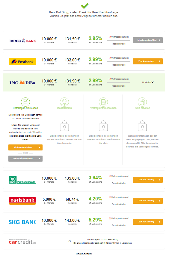
‘Loan Offer’ cards redesign by prioritising information and using visual hierarchy design principles to decrease the cognitive load.
Redefine the technical logic behind the search criteria and its display
Account center. A user profile where the user can come back to whenever they sign into the platform. After the success of the first quarter, the team took over the responsibility of the user account center (not included in this case study)


Mainconcept and wireframes for the offer page.
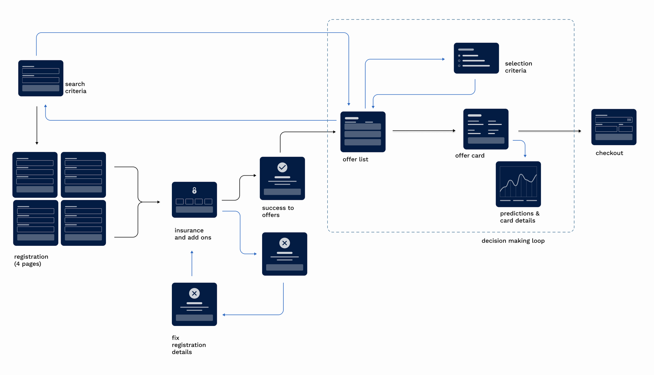
* Basic sitemap and rough user flow - This was used to bring all developers from the team on the same page as to at what part of the journey were we tackling the users’ problems *
Over a period of 6 months, all concepts and designs were tested and iterated upon,
In two weeks increments a new wireframe or almost fleshed out final design along with new micro copy was tested. Within each testing cycle, we had a minimum of 5 testers. The majority of the tests were led by the user researchers and designers together. We used a variety of different methods to test our concepts. Eye tracking, cognitive walkthroughs, Co-creation sessions with real users and usability tests. If one part of an iteration was found successful, (even if it was a small change in the micro copy of the button) it was taken out of the ‘work in progress’ work package into the ‘user validated’ work package, where it would be communicated to the PO, TL and developers on the team (FE, BE & QA) to take over the feature from development sprints to Quality Assurance and final deployment
This continuous design and test cycle was an integral part to our internal team development process and was in fact the key to our success. During the early work process workshops we had come up with a rough process that the team wanted to test and improve as we go along. The final deployed experiences were created and deployed as a result of this collaborative internal process.
The developers worked closely with the designers and were involved in every iteration and in every testing feedback session. We had two handover sessions established between the designer and the developers. One session was dedicated to the research and UX design handover to the Interaction designer and one was dedicated to Interaction designer handover to FE developers. Even though all parties were continuously involved, we still maintained official handovers for documentation purposes and as a chance to clarify any last questions. Once the developers push the finalised designs into production and QA, there was another design QA round established as a last QA check to ensure everything was top notch before going live
The image below shows the final result of our collaborative team work. The copy was refined after weeks of testing. The final design of the card was iterated on for 2 months, each time with a new improvement that brought us closer to what the user really needs and what was crucial to their decision making process.

*This is the last design iteration that we had as a team and is currently live*
CTA controversy
The decision to hide the main conversion button was one of the most controversial decisions we took as a team.
We decided to remove the button because we felt that it created an unnecessary cognitive overload on the page, and was not needed at this stage of the user’s journey where they are ‘studying’ the different offers given to them.
In order to solidify our gut feeling we needed to test it in real time. We set up an AB Testing model and made the whole card clickable to maximise the chances of the user engaging with the card and the results were on our side. This came even as a surprise to us!
With the data backing us up that hiding the button on the card does not effect the conversion rate to sales negatively, we were able to move forward with the decision. The results showed more engagement with the card (which was expected) It also showed an increase in users converting to the next stage of the process ‘checkout’.
We are all very proud of our work together.

Expanded card view
While you’re here, check out this project!
UX strategy in an MVP
Usability Testing & Design Validation
Work packages and team collaboration